--bg-colorLight #fbfbfbDark #0a0a0aPage background · bodyDesign System
Momo’s visual spec: color, typography, spacing, radius, shadow, motion, and the components used across the site.
01
Color
Colors come in three layers: surfaces, text hierarchy, and semantic colors.
Surfaces
--surface-colorLight #ffffffDark #141414Surface · cards / panels--surface-color-hoverLight #eeeeeeDark #262626Surface hover · hover / chipsText
--text-colorLight #000000Dark #ffffffText · headings / body--text-color-70Light #4c4c4cDark #b5b5b5Muted text · meta / captions--text-color-30Light #7a7a7aDark #8a8a8aFaint text · placeholder / disabledBorders & brand
--border-colorLight #d6d6d6Dark #3d3d3dBorder · dividers / cards--border-color-strongLight #b5b5b5Dark #5a5a5aStrong border · hover / focus--quote-left-colorLight #dadde1Dark #606770Quote rule · blockquote left rule--link-colorLight #10558cDark #57ace7Brand (text) · links / icons--accent-bgLight #10558cDark #0d5a94Brand (fill) · primary button--accent-fgLight #ffffffDark #ffffffOn brand · text on accent--accent-softLight rgba(16, 85, 140, 0.08)Dark rgba(87, 172, 231, 0.12)Brand tint · soft highlightSemantic
--success-colorLight #009400Dark #009400Success · tip callout--success-bg-colorLight #e6f6e6Dark #1a2e1aSuccess surface · tip callout--error-colorLight #e13238Dark #e13238Error · caution callout--error-bg-colorLight #ffebecDark #3b1d1eError surface · caution callout--warning-colorLight #e6a700Dark #ad8002Warning · warning callout--warning-bg-colorLight #fff7edDark #332a00Warning surface · warning callout--info-colorLight #4cb3d4Dark #4cb3d4Info · important callout--info-bg-colorLight #eef9fdDark #1a2d33Info surface · important callout02
Typography
Body copy uses Source Serif; UI labels use WenKai; the wordmark and footer use EB Garamond; code and numbers use JetBrains Mono. Sizes are listed below.
Type scale
Momo Ag 123
Momo Ag 123
Momo Ag 123
Momo Ag 123
Momo Ag 123
Momo Ag 123
Momo Ag 123
Momo Ag 123
Momo 设计规范
Momo 设计规范
Momo 设计规范
Weights
Momo Design System
Momo Design System
Momo Design System
Momo Design System
Line height
A line of copy that wraps, so the rhythm of the text is visible at a glance.
A line of copy that wraps, so the rhythm of the text is visible at a glance.
A line of copy that wraps, so the rhythm of the text is visible at a glance.
Font stacks
Life is colorful.
Momo
Search / 搜索
const token = 8;
03
Spacing
A 4px base with ten steps. Inner component spacing uses the same set.
--momo-space-14px--momo-space-28px--momo-space-312px--momo-space-416px--momo-space-520px--momo-space-624px--momo-space-732px--momo-space-840px--momo-space-952px--momo-space-1064px04
Radius
Four steps plus a pill. Cards use lg, buttons and fields use md, filter chips use sm (6px rounded labels), tiny badges use xs.
xs4pxinline code / tagsm6pxchip / tooltip / calloutmd8pxbuttons / fields / rowslg12pxcards / code blocksxl16pxmodals / drawerspill999pxpills / avatars05
Shadow
Static cards use xs/sm, popovers use md, drawers and the lightbox use lg/xl.
XSStatic card
--momo-shadow-xsSMCard / image
--momo-shadow-smMDPopover / hover
--momo-shadow-mdLGDrawer / large layer
--momo-shadow-lgXLLightbox / full screen
--momo-shadow-xl06
Motion
Three durations, three curves. Movement settles with ease-out; objects with volume may overshoot slightly. Text only changes color.
Duration
--momo-t-fast140mshover / focus--momo-t-base220msmovement / enter--momo-t-slow360mslong / stagger--momo-t-press90mspress feedback--momo-t-reveal800msentrance / scroll reveal--momo-t-reveal-row480msentrance / list rowsEasing
--momo-ease-outcubic-bezier(0.22, 1, 0.36, 1)settle · no overshoot--momo-ease-popcubic-bezier(0.34, 1.56, 0.64, 1)light overshoot--momo-ease-sheetcubic-bezier(0.32, 0.72, 0, 1)sheet · fast in, slow outEntry travel: cards rise 32px with a 0.96 scale (--momo-ease-pop); prose blocks rise 120px (--momo-ease-out).
Preview
--momo-t-fast--momo-t-base--momo-t-slow--momo-lift · -1px
--momo-lift-card · -2px
--momo-lift-emoji · -4px
07
Buttons
Three variants (default / primary / ghost) × three sizes. One primary action per page.
Variants
Sizes
08
Forms
Inputs, textareas and search share the same border and placeholder color. Focus turns the border brand blue.
09
Cards
A card is surface + 1px border + lg radius + one shadow step. Article cards skip the surface and keep only border and shadow; clickable cards lift 2px and gain one shadow step on hover.
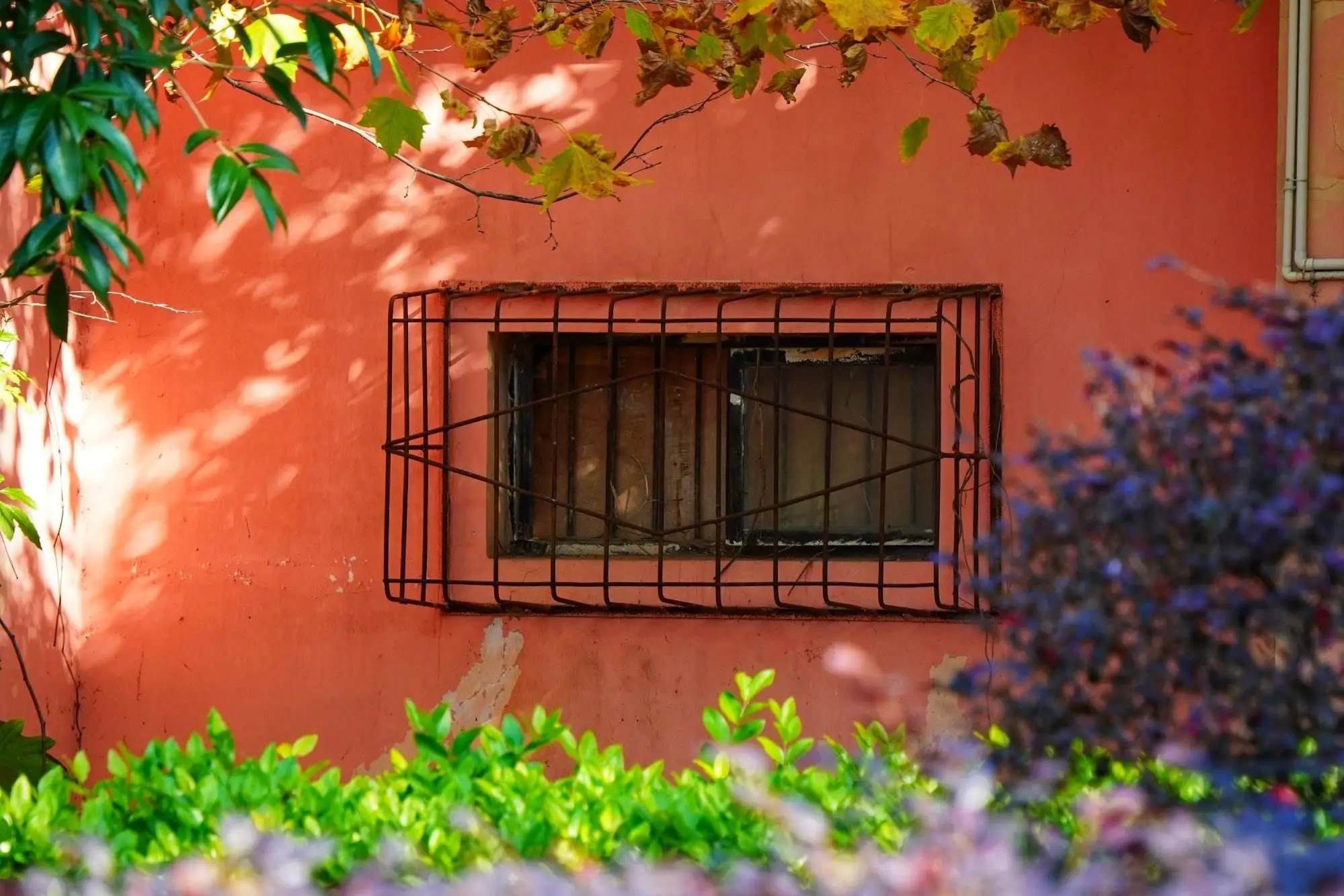
Static card
Surface, border and one shadow step.
Interactive card
Lifts 2px and gains one shadow step on hover.
10
Tags
Interactive categories / filters use chip (a 6px rounded label); read-only locale and category markers use tag (a 4px badge). Selected is always blue on white.
11
Notices
Five semantic callouts (note / tip / important / warning / caution) with a colored left rule and an icon in the title. tip / important / warning / caution take their colors straight from the semantic tokens.
NOTE
A plain note.
TIP
A suggestion that saves time.
IMPORTANT
Read this before acting.
WARNING
Worth noticing, but not blocking.
CAUTION
Risky: this can lose content.
12
Layout
Only two widths: 776px for prose, 1024px for header and footer. Breakpoints follow Tailwind sm / lg; mobile kicks in at 776px.
Breakpoints
640pxTailwind sm · small phone
776pxsite mobile boundary · TOC / FabMenu
1024pxTailwind lg · desktop layout
13
Prose
The block below is real Markdown, rendered by the same markdown.css as article pages: headings, quotes, lists, code, tables, captions.
14
Custom syntax
Music cards, GitHub cards, centered quotes and inline syntax all come from Markdown plugins; the demos below use the same classes, and the two cards render the real directives with live data.
GitHub repo card
::github{repo="Motues/Momo"}Music card
::music{id="30431366"}Centered quote
::quote[content]The same kind of information, shown the same way.
Inline syntax
{base}(reading) · !!spoiler!! · ==rainbow== · ++underline++Designhover or click to revealRainbow textUnderline
15
Comments
The comment area has no card shell: avatar + name + time + body, then name / email / website fields and the body input, with buttons at body size. Bodies support Markdown; emoji render inline at 1.25em.
The demo reuses the utility classes of the live comment components (CommentItem / Comments): inputs, textareas and buttons all use --momo-radius-sm (6px), and text-red-500 / min-h-[100px] come from the live components too.
16
States
Three states: loading, empty, and failed.
LoadingLoading data
∅Nothing hereTry another keyword, or come back later.
!Content failed to loadThe network may be unstable. Try once more.
17
Accessibility
Keyboard focus stays visible, icon-only buttons always have a readable name, and reduced-motion stops movement while keeping color changes.
Keyboard focus
Tab through the page: buttons and links get a 2px blue outline.
Icon buttons · Reduced motion
Icon-only buttons need an aria-label so screen readers can name them. When enabled, movement stops and color changes stay.
18
Where styles live
New styles go in one of four layers: token, base rule, shared component, or page-private.
| Layer | Location | Example |
|---|---|---|
| Token | variables.css | --momo-radius-lg |
| Base | global.css | body / ::selection |
| Component | components.css | .momo-card |
| Feature | page / component styles | .ds-swatch |
inline codeand lists all work.